I’ve had a glimpse of what it would be like to have an entire house designed for myself; to have my needs and desires turned into a space I then inhabit; and to live in an environment, rich in self expression and nourishment. What an absolutely amazing experience and process! And, yet, curiously, I’ve had this experience not from buying property and then working with an architect and interior decorator but from working with an Etsy jewelry designer, Mara Marlow, who makes custom fashion jewelry, as well as selling ready made pieces in her shop, Ambient Zebra.
I’ve bought many a thing from her. Recently I asked her to make me an item that wasn’t based on another in her shop. Nor was it like anything I’ve ever tried on or actually even seen in real life! I wanted a shoulder necklace, and it was this experience that was most extraordinary!
Do you own clothing or accessories that really make you feel like you’ve come home?
How about to a palace?
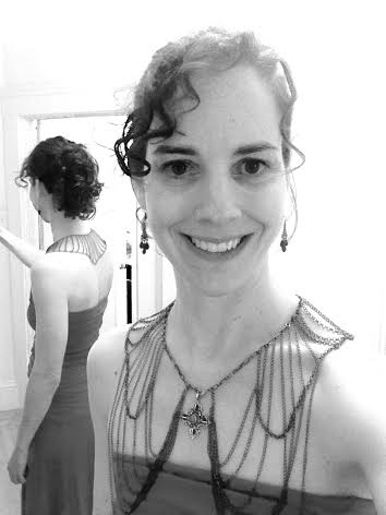
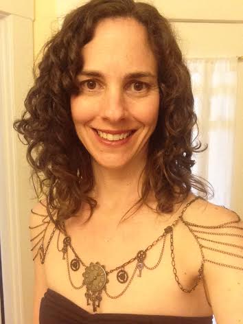
The steampunk festoon part I’ve had and worn as a necklace for a while now. It’s a piece I commissioned from Mara. The arm and back piece (which turns the necklace into a shoulder necklace) is the new part. And, folks who appreciate slow fashion and versatility, take note: this is a convertible piece! It  works in many ways, producing a variety of looks, alone and with other pieces. Sit tight, I’ll show you 8 different looks. (1, at right)
(2, at left)
First, know that Mara is a true artist. She is not someone who copies. You share your inspiration and needs with her and she goes from there. She improves on your and her own ideas as she works.
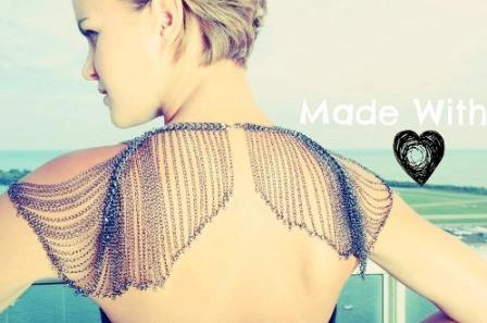
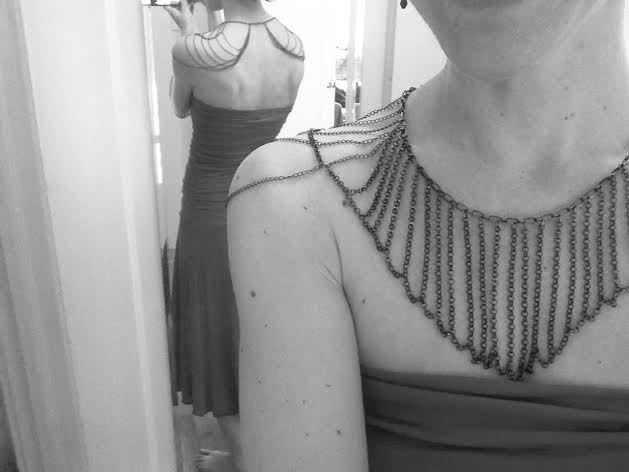
When I asked Mara if she’d ever made a shoulder necklace (she said no, but she was up for the challenge!), I sent her links to a few bridal shoulder necklaces with front views I liked – and for the back, I included this (non bridal) piece, below.

I also told her I wanted to use my steampunk necklace from her as the centerpiece. Then I let her work. (Ok, maybe I sent her a few more images in my excitement. But I try to behave and give her space.)
The chain link shrug image might look familiar. Prompted by Andrea Siegel, in her mind bending book, Open and Clothed (the review of which you can read here), to consider clothing that I’d like the SOUND of -literally the sound of- this was the winner. I could imagine the swishing sounds of the chains, but when I realized that a favorite necklace of mine could be on the front, I fell in love with the entire concept.
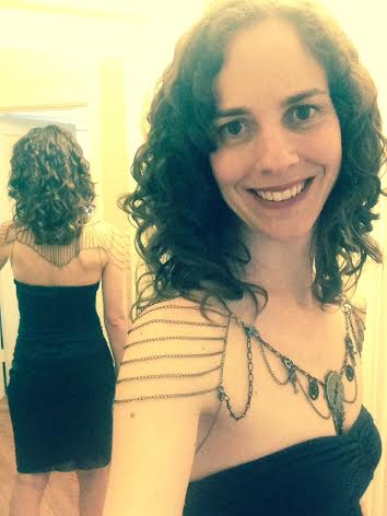
To compare, here is what the back of my shoulder necklace looks like. And in case you were wondering, not only does my shoulder necklace sound lovely, quietly jingling with my every movement, it feels absolutely AMAZING on. The weight evenly distributed, I can scarcely feel it’s there, yet as I move, the chains caress and gently tickle my skin! (Who knew?!?!) It’s incredibly soothing! That the piece hangs most best with back straight and shoulders down no doubt contributes to my sense of well-being when I wear it. (Standing properly feels SO much better than slouching! Thank you, lovely item of jewelry for teaching me this important lesson!)
All in all, I feel extraordinary wearing it – as though I’m sporting a super hero cape flying behind me that captures magic and brings miracles and beauty my way all day. Really, I do. This feeling shouldn’t be something we only achieve on our wedding day. The right jewelry, with the right outfit, can transform you and any day!
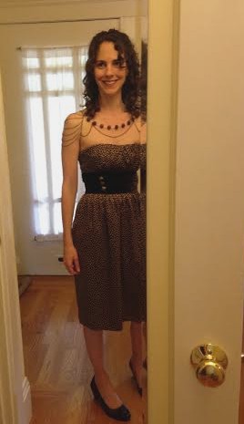
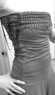
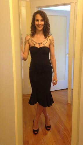
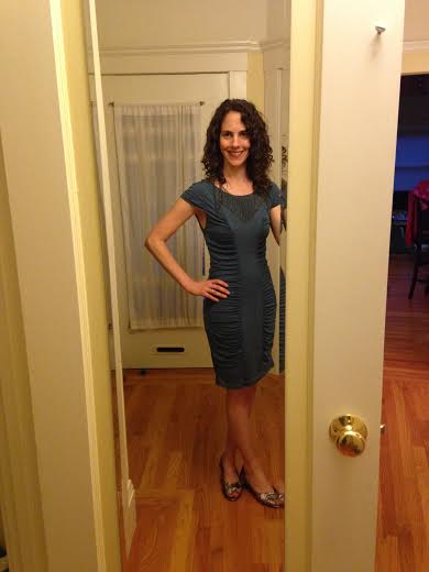
With the steampunk centerpiece on the shoulder necklace, I keep the rest of my outfit simple, letting the necklace take center stage.
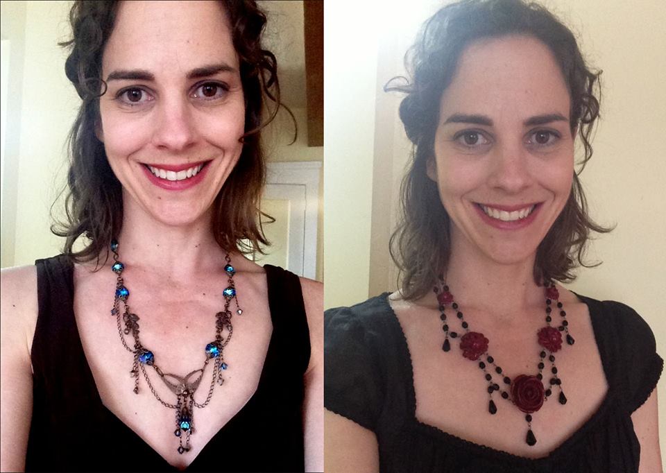
Here I’ve switched out the necklace on the front again. It’s actually a wooden bobble necklace Mara restrung and adapted to work with Got Your Back (the name of the arm/back piece).
(3, below)

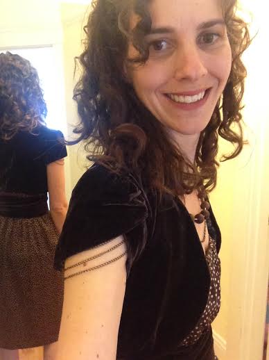
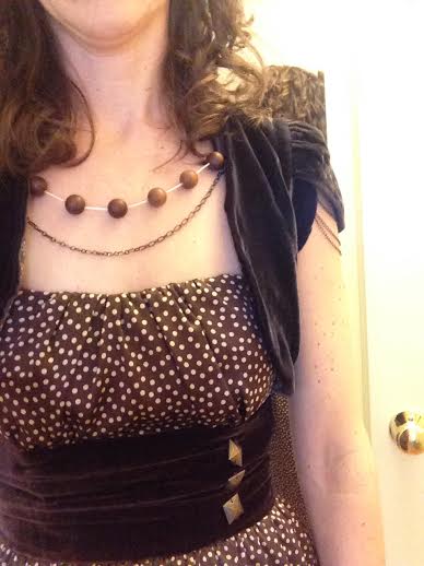
In this outfit, I balance the level of intricacy of the dress (in terms of texture changes, the print, and the embellishments) with the shoulder necklace, which also has texture changes and elements of different size.

 I love how the arm chains drape out beneath the tulip hem sleeves of my bolero (left), and that the ingredients of this outfit (right) remind me of the successful but unexpected combination of chocolate, sea salt and chile!
I don’t abide by the suggestions often made for a minimal necklace or just earrings when wearing a strapless garment: if I did my strapless tops and dresses would look like they were falling down! I have a long decolette which means lots of empty space. Knowing your proportions and scale; understanding your facial feature; and realizing your overall vibe helps you to select the most flattering necklaces. My best necklaces are delicate but not small in size, and they contain a range of various sized components and spaces within, with more small components than large.
Statement bib necklaces, I love, but 99% of the time they are too chunky and not long enough on me. Multiple layered chain necklaces I also ogle, but on me they are long and narrow, taking my face completely out of focus. If you know what works on you and want to expand your repertoire, consider necklace styles that you admire from afar and brainstorm ways to adapt them to suit you! GYB encompasses what appeals about each of these two styles. I retain the delicacy and face framing aspects that I need AND enjoy the statement and long chain effect! Win-win! Play with your necklaces and anything jewelry-like (ribbons, zippers, etc) in the mirror. Take photos and keep tweaking and experimenting, with your most flattering necklines on please, until you like where you’re going with length, size, shape and scale. Use this information to buy jewelry wisely.
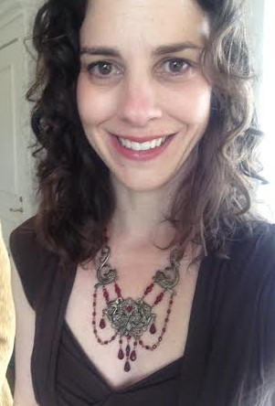
On the left, below, I’m wearing a comparatively simple necklace, Mara made for me. On the right (and also shown above), I’ve turned the outer ends under and attached it to GYB for a really pretty look.

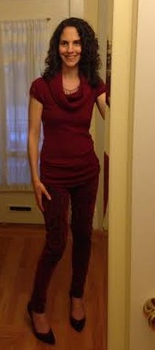
My outfit is still a backdrop to the shoulder necklace but now I’ve changed the skirt for one that is more elegant, keeping in sync with the necklace used. The beads are silvery teal with purple highlights.
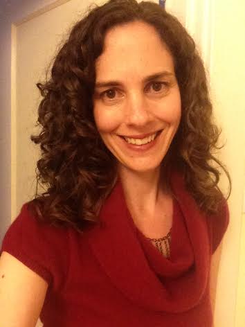
In the next couple of photos, I’m wearing Got Your Back alone without additional necklaces. Here it’s turned back to front under my red cowl neck, barely peeking out. It looks like it’s part of my sweater, and partially covered in cashmere, it flirts with the world in a coquettish sort of way.
(4, left and right, below.)

The dangling chains add delicate drama to my sweater and the darkness of the gunmetal connects the top half of my outfit to the brocade of my jeans.

Here’s GYB is worn back to front and pulled forward, with the small extension chain (included with the purchase) so that the necklace can follow the dress’s neckline, again resulting in my clothing looking embellished rather than accessorized.
(5, above)
The vertical seams in the center part of the dress are enhanced by the verticals of the falling chains .
Working with Mara, you will be part of the design process. You initiate the work; you see it as it’s progressing; you make further choices along the way: then you get your affordable custom-made one-of-a -kind-piece shortly thereafter!
It’s fitting that her Etsy Shop’s name, AmbientZebra, was inspired by Dr Seuss’ book On Beyond Zebra, a story in which wonderful but unknown animals are shown to exist, their names starting with letters of the alphabet that we’ve never heard of before. My mom came by while I was taking photos of the shoulder necklace with bobbles on it and exclaimed – her attention clearly focused on the jewelry, “Oh, wow! How beautiful!!!” when I rather expected her to say, “So, what exactly is that thing you are wearing?” She never even asked.
It’s been an unexpected surprise that I get compliments on my GYB renditions (creations?) from men and women, and from all generations. Don’t be afraid to be different. Different can still have mass appeal.
Here is GYB worn with a pendant (one I already owned) rather than a necklace, and pulled forward. For someone that wears crew necks this would be a be fun to spice them up!
(6, below)
 What item do you own that you currently wear in a multitude of ways? What item could you play with to explore new options?
This is what it looks like worn back to front and spread out across shoulders:

(7, above)
Don’t you love the different patterns that form on the back?
You could also wear it as a decorative trim to a strapless dress with the longer extension chain link piece (that comes with GYB) in the back. Similarly it can also be worn as a belt, draped a little or held taut so it is belted straight across.
(8 , below, and would be 9, if I’d taken a photo of it as a belt too!)

I’m sure I haven’t even begun to exhaust all the ways to wear it! (Do tell me if you can think of a tenth!)
Mara is funny, talented, kind and FAST. Adaptable and resourceful, she’ll happily incorporate beads and components you send her too.
Here are other necklaces that Mara made. Bear in mind that her designs come in a wider range than what I wear. Treat what you see in her Etsy shop as a starting point if nothing screams BUY ME JUST AS I AM! You won’t find a lovelier, wiser or more dedicated fashion jewelry designer.
Mythical beast necklace, above, inspired by a piece she had for sale.
Wooden earrings varnished and turned into a necklace, below.

Mara’s inspiration and ideas come from books, colors, words (!), and stories (!!!). “One of the most influential books was of the jewelry of Miriam Haskell,” she said. “What I saw in those extravagant creations gave me the courage to go ahead and make things just because I wanted to, and not to worry that they were too weird or big or unconventional because SOMEBODY will like them!” (Me! Me! Me! And what a great attitude for us all to have about what we wear, and what we create, each day!)

My earliest Ambient Zebra pieces! The one on the left I bought straight from her shop, the one on the right was custom made, inspired by a necklace she had for sale.
Friends near Seattle: Mara works at two markets in Washington State: the Federal Way Farmers Market, www.federalwayfarmersmarket.com/, and the Des Moines Waterfront Market www.dmfm.org/DMFM/Home.htm. Look for a woman with a long braid down her back, selling jewelry that’s just a little bit different. You can also message her through Etsy to get her schedule. When she’s not making or selling jewelry (fulfilling her childhood fantasy of being surrounded by boxes of jewels and treasures), she’s outside working on her edible garden, or inside cooking something spicy. In addition to knowing how to make your everyday jewelry dreams come true, she also appears to have the art of living figured out!
Necklaces from Ambient Zebra range from $39 to $79. A gunmetal GYB like mine sells for $120. (Message Mara through her Etsy Shop, here, if you’d like to have one made, or about any of your other fashion jewelry related heart’s desires…I just did! Twice.)

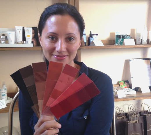
 Top right, she brought only her Suzanne Caygill palette when she came to see me. I saw it after I completed my palette for her. I did not want to see it before as I didn’t want to be influenced by anyone else’s opinion – not even Suzanne’s!

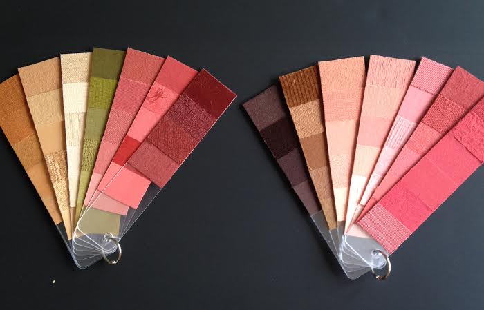
 Another shot of the palette – here you can see, from far right working in: glasses colors , green eye colors, pinks (after the magenta of freshly dyed hair fades slightly) then her natural hair colors as they start coming through before she re-dyes…and her rainbow!
 Daughter and Mom’s palettes named respectively,