Category Archives: Color Science

Frequently Asked Questions!

A lovely woman from the Czech Republic emailed me with questions.  I thought why not share my answers in case some of you are wondering the same things. (And if you have other questions, drop me a line and ask!)

Q. “Do you consider personality – for example if someone loves colors that are not the best for him/her?”
A. I choose colors for a palette based on my client’s coloring (see this blog post for a review of that) but I can think of four cases where other factors come into play:

1) If a client loves yellow/pink/green/whatever hue and is DYING for it to be in their palette, 
for example, yellow but it’s not one of their best colors, then I will SHOW them their best yellow , let them photograph it and compare it to other yellows so they can really ‘learn’ it, but no, they do not actually GET it in their palette from me. I tell them that they should wear their best yellow with one of their best colors (actually in their palette) and in a style that is FANTASTIC for them.

2) If someone’s palette feels at odds with
 a person’s environment (let’s say they work in  a very corporate environment and their palette feels sweet and girly) or their personality doesn’t mesh with their colors (perhaps they are very quiet and their palette goes loud) then when it comes to how to actually USE the palette, I help them do that successfully so that they feel and look fabulous (and appropriate).


3) If someone is very fair in skin and has light/soft (in color) hair and they NEVER wear make up they’d get a different palette than their identical twin sister who LOVES makeup and doesn’t leave home without filling in her brows and at least wearing mascara, blush and lipstick too.


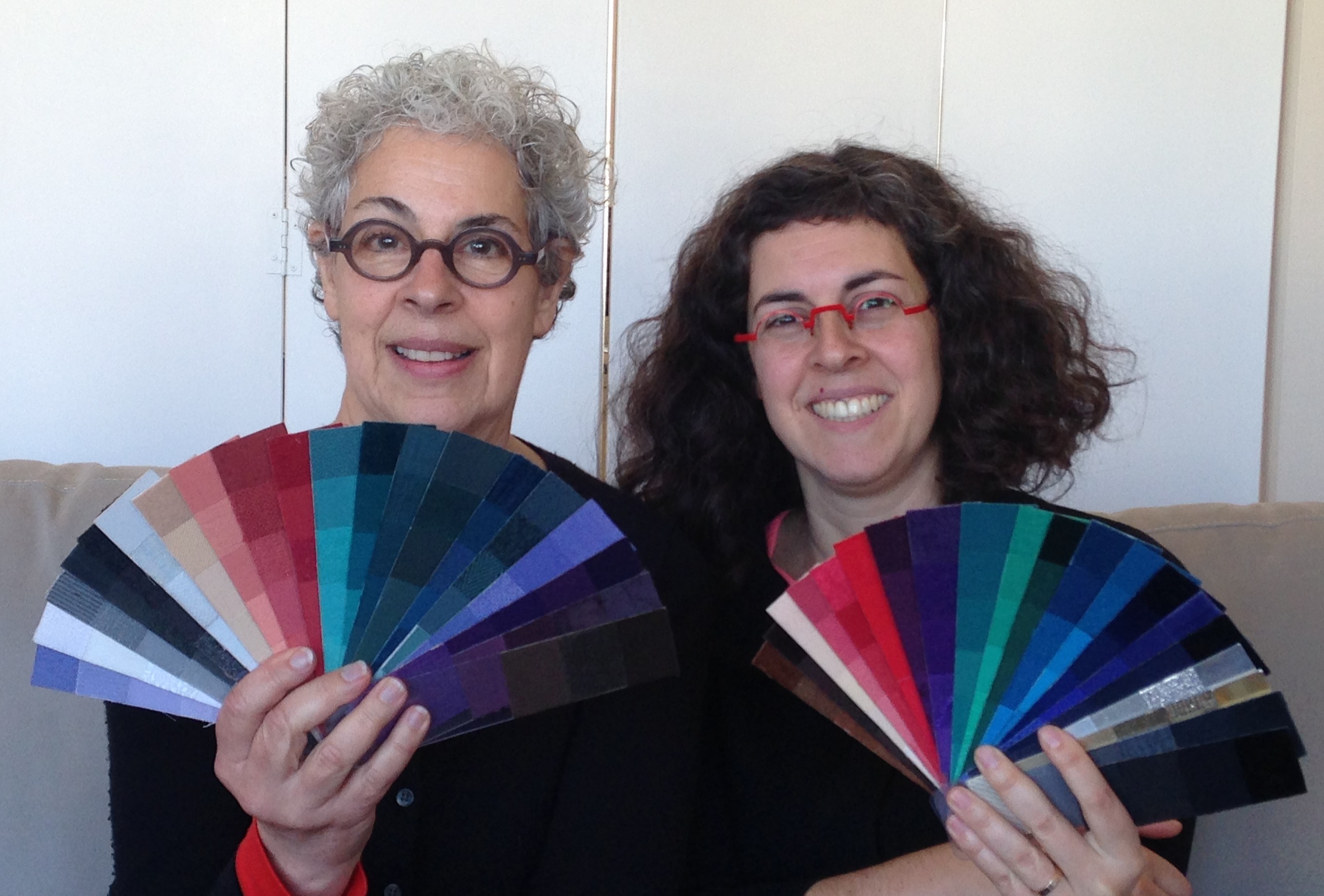
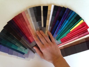
4) If someone wears a color they love daily
, for instance, as glasses or hair color then I’ll work treating that as though it is a fixed fact – a part of their own natural coloring.  That’s what I did for this client who keeps her hair colored pink and wears her two tone glasses all day (not just for distance or reading).  Bear in mind when I choose such colors, like with selecting any client’s “body colors” (meaning, colors that relate to their hair, skin, eyes, blush), the colors I pick may not be literal translations. They are colors the MAGNIFY beauty of the entire being when worn as clothing, makeup and accessories.

gwen-usethisone

wickedskittlesAnother shot of the palette – here you can see, from far right working in:  glasses colors , green eye colors, pinks (after the magenta of freshly dyed hair fades slightly) then her natural hair colors as they start coming through before she re-dyes…and her rainbow!


Q. “Do you name all your palettes?”

A. If clients want a name then, yes, we name the baby!  Usually I suggest a handful of names based on enticing things the colors make me think of, hear or smell. Working with clients online, I’ll have often had a lot of conversations with them and get ideas also based on their interests, location, etc. Sometimes clients love one suggested name and selection is fast.  Other times one or two suggestions feel ‘almost right’ so we fuse, modify or keep searching from there. Occasionally clients want to name their own palettes.

Bear in mind that my brain is trapped and temporarily detained in color-selection-mode at an in person appointment (and when I am working on palettes for online clients) right after completing your palette.  It needs time to decompress and switch gears to name-creation-mode. Think of the excitement of learning your best colors and – if you want a name for your palette, getting that name pinned down as two distinct, fun events!

maggiechloeDaughter and Mom’s palettes named respectively,
“Glitter Bug” and “Angelic Mermaid” AFTER the in-person appointment


 Q. Will you be in London seeing clients in summer, 2016? If so, when and how long is an appointment?

A. I would love to work in London in the summer of 2016 but it’s not confirmed yet.  It’d be the end of July/start of July in Wimbledon over a couple of weeks. Let me know if you are interested!  Seeing clients face to face, the color analysis takes 1-2 hours. (Online takes me much, much longer as I have many ‘targets’ (you in each photo) rather than one (you in the chair)!  For those of you wanting style too, that is done based on meeting you and then online photos of your in outfits -so I can see what you own, how else you might combine items, what’s missing, your proportions, etc.

Regarding travel: if you have a handful or more of people in one location who want colors done and will commit in advance, do let me know.


Don’t forget, if you have questions not yet answered, drop me a line! I love hearing from you!

Advertisement

Decoding Color Exquisitely

The only kind of high that I like is a color high.  I’m coming down off one now and it’s a dreamy, soft descent.  It started with a gentle glow at a book reading on Sunday afternoon, amid an eager crowd, hearing women whispering of paint and clothing colors as I found a seat.  Then mother and daughter authors, Joann and Arielle Eckstut, took to the podium and filled the room with laughter, delight and many a gasp, as they shared favorite snippets from their their visually stunning book, The Secret Language of Color (officially on sale October 22nd but available for preorder here ).

With slides to accompany their talk, they confounded the audience with optical illusions; bookreadingwowed us with nature’s beauty and challenged our brains with the physics of color.  (For the record, that tree that fell in the forest without a sound?  It was colorless too.)  Our magical journey through the rainbow involved leaps through history, trips over seas and reflections on the sky; we put on robes of the aristocracy and the eyes of bees.

And, then just as I was getting the hang of flying through time and space, and inhabiting other species minds’, the color ride and indeed Q&A time was over and the pot of gold – the book itself – was at the cash register.  Legs moved fast and for a short while the vibe turned tense as there appeared to be a shortage of copies of books for sale. “That one is mine! But, yes, you can look!” I heard several times.

Outside, sitting in the sun (Book Passage in Corte Madera has the nicest set up), I dived into the book, then splashed around like a dolphin, frolicking in the sea.  I delved deeper at home.  The book  tantalizes, but more importantly, it satisfies.  It’s the kind of book you can enjoy for a minute here and there just as much as an hour now and then. The photos are glorious and seemingly never-ending, the graphics flawless and the writing is charming. And, for those of you who often feel cheated of intellectual depth in coffee table books, you can rejoice!  There is real substance here.  Spare yourself three years of color related research and read this.  (With the saved time, you might like to try out the recipe for tyrian purple (purple made the old fashioned way).  Warning: you need 1000 mollusks and good aim.)

Obsessed with color as it relates to the human body, my own favorite morsels include:

  • learning that humans are better able to discern shades of yellow than any other hue.
  • seeing Pierre David’s Human Pantone rainbow collage, comprised of (photos of) human skin.  (It is beautiful not macabre!) Enjoy that artistry here.
  • discovering that plants have small amounts of melanin too, evident in fruits that bruise!

Speaking of which, I knew that our color vision was thought to have developed to allow us to find the ripest fruits. But there is a new theory, did YOU know?  

  • Our vision may have evolved to being more complex  (though not as complex as a butterfly’s) to better understand other people around us! That leg is a bit blue, that face is turning green, that person’s chest and now neck and now face is going RED!  Respond!!!

No one, the Eckstuts will tell you, is an expert in color, yet you certainly feel a lot smarter with words from these women at your fingertips.  In addition to being authors, Joann Eckstut, founder of The Roomworks, is an interior designer and color consultant; her daughter, Arielle Eckstut is a professional Book Doctor and co-founder of LittleMissMatched.  Both predict annual color trends for the Color Association of the United States, Joann for interiors/environment and and Arielle for young fashion.

My hour at the reading was fabulous enough but then I had the additional pleasure (hence the sustained color high) to chat with these woman again the next day as I showed them how I find personal colors.  It was quite a treat.

. joann and arielle

Almost done…joannfinalfan


photo

Joann’s also has shiny silvers, some plums and more warm reds.

Arielle’s also has nearly stark whites, lucky-in-the-East yellows and a few more orange-reds. 
photo

The black and silver in the middle are shared.  

Now, go and get this book.  You can’t, in all seriousness, call yourself a Colorista, a Color Freak or a Color Nerd without it.  It’s also a great  gift for any of your friends who fancy themselves part scientist/social scientist/artist or trivial pursuit master.  Even a color blind, mathematician friend would probably love it.  It’s that good.  Really.  (Buy it hereor, support your local bookseller.)

The beautiful fabric swatches I use are part of Debra Lindquist‘s Color Profiles System.

Until the tetrachromats take over, I’m enjoying this gift

At the playground, my daughter ran up the steps, crossed the wobbly bridge holding my hand,  slid down the slide,  then banged on the children’s chimes. Over and over again, she did this, following the same route, repeating the same events.  She is visually impaired and such repetitive behavior is common in open physical environments. It’s an adaptive way to learn the lay of the land and simultaneously play safely.  Nobody taught her to do this: she just does it – often to the frustration of other children who want to play with her.

chatted to my friend, Heidi, a violinist.  Mid-conversation, Heidi uttered, more to herself than to me, “It’s a shame the D is flat.”  

chimepanel_640

Whaaaaa?  The comment stunned me.  Now, Heidi wasn’t spotting a child as I was, but she was having a conversation with a woman on the move (me) and surrounded by a cacophony of children’s voices.

We all notice different things.  We have different sensitivities, different genes, different adaptations.  Heidi later told me that her dad required that the she and her sister learn to identify notes.  She has relative pitch.  She can always identify a note played on a violin, and almost always on other stringed instruments.

My online friend, Blakely, shared this article about the identification of a woman with genetically inherited  superior color vision.  This woman possesses four types of cones (color vision cells) rather than the standard three, and what’s significant – she uses them. She is a “functional tetrachromat” and sees much more variation in color than the rest of us.  Other tetrachromats had been identified, but they do not actually use the fourth type of cone.  Does our culture, comprised primarily of trichromats, not encourage the development of superior color vision?  Possibly.  So why did this ONE woman’s vision become functionally superior?

IFI have attended very few music classes and I was not raised in a house full of music. But we did go to many an art museum; I was always drawing; and I’ve always loved color. I know that my third grade teacher’s lipsticks were perfect for her, and so were her clothes.  I had eye surgery as a baby and while my visual acuity is fine, I lack stereoscopic vision.  In other words my brain cannot use information from both eyes at once. I rely on shadows; texture and color changes;and relative size to identify and understand things like steps, gradient changes and to judge distance.  So I might be more sensitive to color as an adaptive response to a biological shortcoming, however I don’t think I see variations in color exponentially more than others. I don’t think I’m tetrachromatic. I do think that I have a good eye for color harmony, particularly as it relates to people and what they wear.

I studied color analysis professionally because I wanted to improve my ability.  I knew I wanted to make custom color palettes (this means each is unique to the recipient) rather than to identify the best of a set of prefabricated palettes (the more common, and less successful approach).  I said in an earlier post that I’m a perfectionist.  I  wanted the greatest challenge: if I couldn’t do color analysis fabulously, and understand human coloring and color harmony enough to create bespoke palettes, then I wasn’t going into the field.  There were better analysts that people that could see.

palettespic

I also knew I wanted to provide clients with highly functional palettes.   Texture affects how we perceive color. Since you wear fabric, your palette should be fabric for ease of matching colors.  Furthermore  your palette should be nicely presented and portable.

Perhaps this woman with superior color vision also reveled in color from a young age, noticing nuances and engaging her fourth kind of cone?  Perfect pitch, for the most part, seems to require the right genes and the right musical training at a young age to develop.  Superior color vision, might also need educational nudging.   Therefore I am noting down

tetranote - Edited

as a future business project.  Just think: if these young ones are interested in color harmony,  they’ll make the highest caliber color analysts, and if not, they’ll be able to enlighten us about a world of MUCH MUCH MORE color!  It’s a win-win!

Perfect pitch is also  more likely among the autistic and  the visually impaired.   In autism, there is often a generalized over sensitivity that  accompanies the reduced perception of social cues.   In those who are visually impaired, as you’d expect, other senses compensate for reduced vision.  My daughter tells me, “The air filter changed note.”  I think she is noticing a pitch change but I’m too clueless musically to be sure.  “Can I have some cantaloupe?” she asks when I pick her up at school and she can smell it on my breath.

One day, on an extremely crowded and noisy bus, my daughter looked withdrawn. Her four year old self does not like it when there are “Too many legs in front of me, Mommy!”  But on this occasion we were sitting down, so she had plenty of personal space.  “Are you ok?” I asked.  “Yes,” she smiled, “I hear church bells.”  I had to listen hard to hear the quiet ringing, beyond the groan of the bus, the whoosh of passing cars speeding through the rain and the discourse around us.  She was not withdrawn, but  drawn in.  It made me so happy that she found such bliss in the middle of all that.

Color harmony is my bliss.  Every day I am so happy that I found color analysis, that I studied it and refined my knowledge.  (Yes, even with my now-lowly-feeling-ever-so-ordinary trichromatic vision.)  Whether I am admiring the sweater choice of a stranger on the street, or working on a client’s palette, I have many, many moments of joy and deep engagement.  Every day I do work that I love; work that adds value to the lives of others; and work that is beautiful.  Until the tetrachromats take over, I’m enjoying this gift.

For more on tetrachromacy, listen to the first part of this fabulously entertaining radio show.   Just don’t blame me when you’re even more confused.  And read here, too. For more about autism and perfect pitch, read here.  We are all unique and special.  I love that my work celebrates that.