
Know what? They matter! Sure, when you’re testing out a color to see if it’s good on you, you hold it up to your face to see how the effect. But your hair color and your eyes matter too. Forget them and you are only looking at part of the equation.
For instance, sometimes bright color works with someone’s skin…but their eye coloring is soft and their hair too. Their eyes and their hair temper this person’s best colors: they don’t support the brightness. An example of the opposite: a person’s eyes are dazzling blue and her hair and brows are brilliant silver. There is a strong connection with bright colors held up near the face BUT…actually, the person’s skin is not nearly so bright. It’s just hard to see that because even with hair up out of the way, her brows and eyes effortlessly steal the show.
Our best colors do not work with only some parts or aspects of our coloring: our best colors work with our coloring in its entirety.
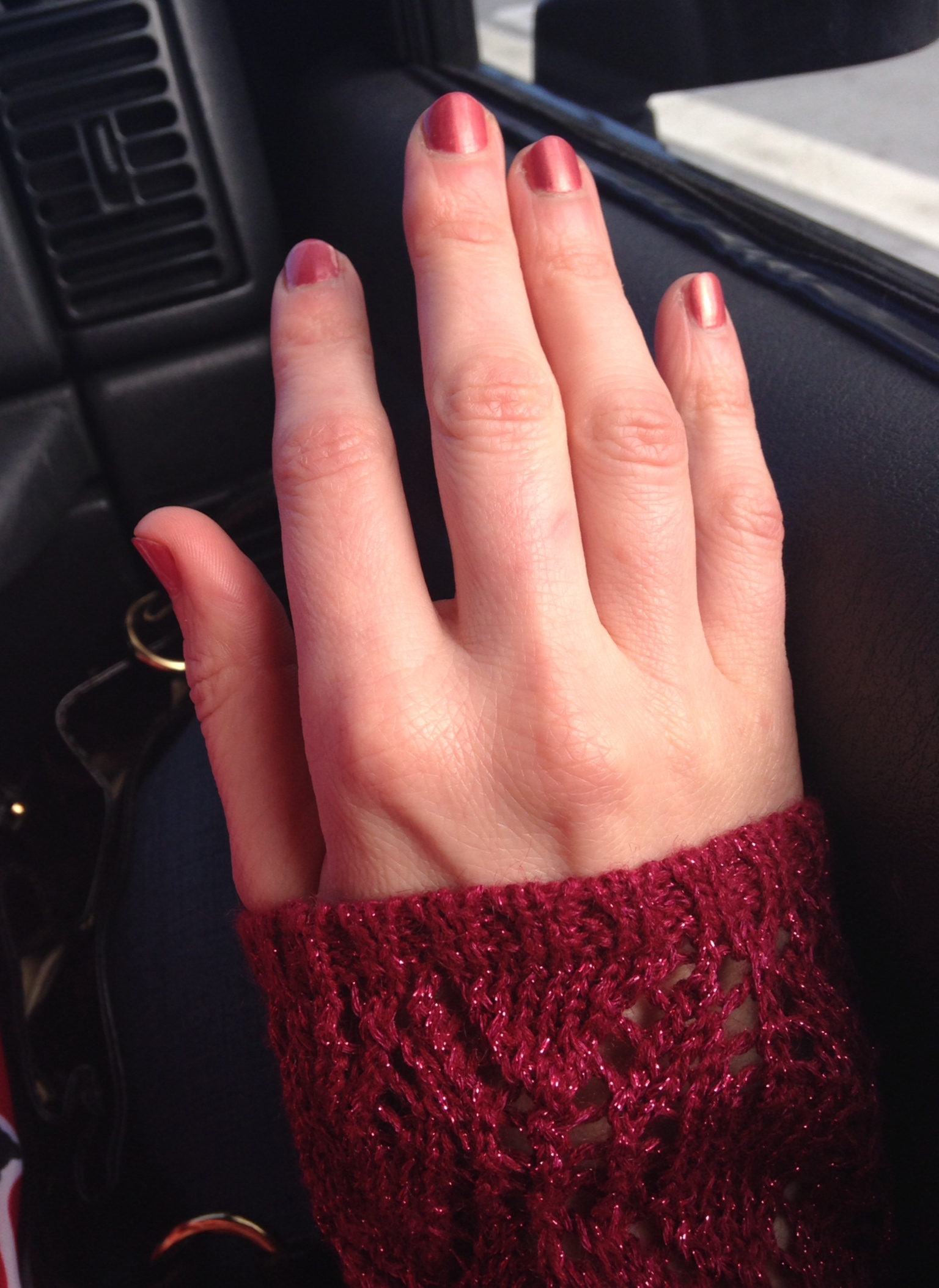
These examples of body colors “pulling” a palette in different directions are big. There are countless other, more subtle combinations and interactions between body colors that exist and must be considered in a personal color analysis. For example, myself: I can wear medium to dark reds really well – dark blues, dark emerald greens, dark purples, and dark grays too. Yup, I fit fairly well into Dark Winter in 12 Seasons. But my blush tones (shown in the photo below in my nail polish) are Soft Autumn. Dark Winter has pinks (and other colors) I cannot wear well at all. My blush tone can’t be overlooked. Human coloring is crazy complex: this is what makes it so fascinating!
I’m connecting the dots when I do a person’s colors, but I’m not connecting them with lines, but with colors themselves. Everything needs to work with everything else. Or else it isn’t really a best color.
Another example: Let’s pretend you’re in a contest to decorate a living room. You are told that the walls have just been painted: the floor has an area rug on it, and there is a new couch in the room. The judges chose these features. They felt they were captivating colors and PERFECT together, though admit they may be challenging to work with. Your job is to finish decorating the room. You have unlimited access to anything you might desire including: bookshelves, ottomans, throws and throw pillows, curtains, lamps, wall decor, candles, even bouquets of flowers. You have three days to complete your challenge and can bring anything you want over to try out in the room – only rules: no altering the walls, rug or couch. Judges are looking for great use of color and a style that is in harmony with the room itself. The most fabulously dressed – oops, I mean – decorated room wins!
While you are running around and considering options, an eager assistant comes up and asks you if you’d like to have the rug or the rug and couch covered with a drop cloth. “But I’m not painting, you say.”
“Oh I know, I just thought it’d help you really focus on the paint color while you’re making your choices,” replies the assistant.
Would any of you NOT want to see the rug and couch colors while you are adding more colors into the mix, trying to make the room look as spectacular as possible??? If you are decorating a room you need to consider ALL the colors involved and likewise, if you’re dressing a body you need to factor in ALL the colors involved too.
Any colors that I can see in a person play a role in determining that person’s best colors. Actually, it’s more than that. Any colors that I can see in, on or supporting a person play a role in determining their best colors. A client who is in a wheelchair has the wheelchair colors used as part of his/her body colors in a personal palette. A client whose eye colors cannot really be seen behind their glasses (sunglasses worn all the time for health reasons or other), then the color of their glasses become extra important to me. They are now a body color, like the wheelchair (but more easily changed for another color!). A client can have vitiligo (patches of skin lacking pigmentation, cafe au lait or strawberry marks, port wine stains or any other kind of birthmark on their face/neck and I’m not phased. I simply take all the colors I see into the equation.
An approach to color analysis that does not consider all these body colors (and the variation within them) misses the opportunity to create consistently great beauty. Body coloring is complex. I’m so glad it is. I love my journey of discovery.
Incidentally, when I select colors for a client, I don’t think in words so much as feelings. My heart grows bigger and my cheeks feel warmer when there is color harmony in front of me. My sensory system is flooded when colors are too bright. My body feels weak when colors are not supportive enough for a person. I’m always looking at the gestalt in my work, not one body color and then another. It’s all at once. But, if you’ve enjoyed reading this, and want more posts breaking down the interactions between body colors, let me know and I’ll do my best to study people with that in mind.
Meanwhile, if you’re new to my blog and want too see photos that quickly illustrate why it’s not just skin color that matters see my earlier blog post here. And, actually, if you’ve only heard of custom analysis based on skin tones, check out my earlier Elmo post demonstrating a simplified version of how I do color analysis. Finally if you want to know what if feels like to get your own custom palette made just for you, then read this post.

Yes, I’d love to hear more about this and body interactions with colour.
Ok, thanks for commenting, Pat!
Oh this is so fabulous! The science behind why my personal palette is so much better for me than the 12 seasons one 🙂 🙂
Glad you enjoyed it! Thanks so much for commenting!
Bravo. Yes, write more, Kathy :)!!
Thank you! Will do!
Great post! I’d love to hear more in this vein.
Thank you. I’ll mentally dissect colors and analyze the parts for ya! 🙂