Category Archives: Customized Color Analysis

How do I know I’m “right”?`

I was talking to someone about being a color analyst the other day and she asked how do I know I’m picking the right colors. “I’m looking for color harmony  between the client and the colors,” I explained, “For the colors to look balanced,  pleasing, and “right” with my client.”

“How do you know it’s right?” she asked.

“Well,” I said, “it’s my own artistic interpretation BUT if you had other custom color analysts do the same person’s colors our results would most likely be very similar.”

Here is an example. These are all custom made palettes for the same person.

IMG_9249

The palette on the top right was done by Suzanne Caygill in 1982.  Suzanne Caygill was not the first person to do study the effect of wearing different colors, but she is regarded as the pioneer of color analysis – and she started the seasonal approach that is so well known.  The palette shown is an Iridescent Summer palette.

The palette on the bottom right was done by Lois Marlow Scott, who trained with Suzanne Caygill and was known as Suzanne Junior. Her palette for this client is an Early Spring palette.

I, not having seen any of these other palettes before, made the palette between these two. You can see how it actually looks like a blend of the two other palettes encompassing both the muted pinks of Suzanne’s palette and the warmer peaches of Lois’.  I was not trained in and do not work seasonally so this palette is not of a particular type. I simply choose the colors that make my client look most magnificent.

You can also see two other palettes and part of third to the left. They look more similar to each other, but still similar to the three on the right.

None of the analysts had seen each other’s work prior to making their own palette for her.So how do I know I am right?  I see it: I see color harmony. But also, by way of visible evidence (separate from photos of my clients with their palettes), here you can see that my work falls between two women very highly respected in this art form.

Edited to add two points, and a photo of the client with these palettes:

1)  This client had light blonde hair through adulthood and then started highlighting, so her hair is more constant than other people’s might be from decades ago.

2) I’ve been asked if this woman would be a Soft Summer in 12 Seasons approach. I can see why this is being asked though there is a yellow-green-peach influence that is being missed..and well, these are customized palettes considering her hair, skin, blush and eye colors not just looking at her skin. Sadly or interestingly, depending on how you look at it, she did also have three 12 Seasons analysis by different analysts both in person and online. She was told Bright Winter, Bright Spring and Light Summer.

All would overwhelm her spectacular quiet beauty which you can see here:

muchablogTop right, she brought only her Suzanne Caygill palette when she came to see me. I saw it after I completed my palette for her. I did not want to see it before as I didn’t want to be influenced by anyone else’s opinion – not even Suzanne’s!

Bottom middle, her palette byLois Marlow Scott, which she brought along with her other palettes when she came back to see me.


Advertisement

Frequently Asked Questions!

A lovely woman from the Czech Republic emailed me with questions.  I thought why not share my answers in case some of you are wondering the same things. (And if you have other questions, drop me a line and ask!)

Q. “Do you consider personality – for example if someone loves colors that are not the best for him/her?”
A. I choose colors for a palette based on my client’s coloring (see this blog post for a review of that) but I can think of four cases where other factors come into play:

1) If a client loves yellow/pink/green/whatever hue and is DYING for it to be in their palette, 
for example, yellow but it’s not one of their best colors, then I will SHOW them their best yellow , let them photograph it and compare it to other yellows so they can really ‘learn’ it, but no, they do not actually GET it in their palette from me. I tell them that they should wear their best yellow with one of their best colors (actually in their palette) and in a style that is FANTASTIC for them.

2) If someone’s palette feels at odds with
 a person’s environment (let’s say they work in  a very corporate environment and their palette feels sweet and girly) or their personality doesn’t mesh with their colors (perhaps they are very quiet and their palette goes loud) then when it comes to how to actually USE the palette, I help them do that successfully so that they feel and look fabulous (and appropriate).


3) If someone is very fair in skin and has light/soft (in color) hair and they NEVER wear make up they’d get a different palette than their identical twin sister who LOVES makeup and doesn’t leave home without filling in her brows and at least wearing mascara, blush and lipstick too.


4) If someone wears a color they love daily
, for instance, as glasses or hair color then I’ll work treating that as though it is a fixed fact – a part of their own natural coloring.  That’s what I did for this client who keeps her hair colored pink and wears her two tone glasses all day (not just for distance or reading).  Bear in mind when I choose such colors, like with selecting any client’s “body colors” (meaning, colors that relate to their hair, skin, eyes, blush), the colors I pick may not be literal translations. They are colors the MAGNIFY beauty of the entire being when worn as clothing, makeup and accessories.

gwen-usethisone

wickedskittlesAnother shot of the palette – here you can see, from far right working in:  glasses colors , green eye colors, pinks (after the magenta of freshly dyed hair fades slightly) then her natural hair colors as they start coming through before she re-dyes…and her rainbow!


Q. “Do you name all your palettes?”

A. If clients want a name then, yes, we name the baby!  Usually I suggest a handful of names based on enticing things the colors make me think of, hear or smell. Working with clients online, I’ll have often had a lot of conversations with them and get ideas also based on their interests, location, etc. Sometimes clients love one suggested name and selection is fast.  Other times one or two suggestions feel ‘almost right’ so we fuse, modify or keep searching from there. Occasionally clients want to name their own palettes.

Bear in mind that my brain is trapped and temporarily detained in color-selection-mode at an in person appointment (and when I am working on palettes for online clients) right after completing your palette.  It needs time to decompress and switch gears to name-creation-mode. Think of the excitement of learning your best colors and – if you want a name for your palette, getting that name pinned down as two distinct, fun events!

maggiechloeDaughter and Mom’s palettes named respectively,
“Glitter Bug” and “Angelic Mermaid” AFTER the in-person appointment


 Q. Will you be in London seeing clients in summer, 2016? If so, when and how long is an appointment?

A. I would love to work in London in the summer of 2016 but it’s not confirmed yet.  It’d be the end of July/start of July in Wimbledon over a couple of weeks. Let me know if you are interested!  Seeing clients face to face, the color analysis takes 1-2 hours. (Online takes me much, much longer as I have many ‘targets’ (you in each photo) rather than one (you in the chair)!  For those of you wanting style too, that is done based on meeting you and then online photos of your in outfits -so I can see what you own, how else you might combine items, what’s missing, your proportions, etc.

Regarding travel: if you have a handful or more of people in one location who want colors done and will commit in advance, do let me know.


Don’t forget, if you have questions not yet answered, drop me a line! I love hearing from you!

Do you have eyes? Eye brows? Hair? No way! ME TOO!

Know what? They matter! Sure, when you’re testing out a color to see if it’s good on you, you hold it up to your face to see how the effect. But your hair color and your eyes matter too. Forget them and you are only looking at part of the equation.

For instance, sometimes bright color works with someone’s skin…but their eye coloring is soft and their hair too. Their eyes and their hair temper this person’s best colors: they don’t support the brightness.   An example of the opposite: a person’s eyes are dazzling blue and her hair and brows are brilliant silver. There is a strong connection with bright colors held up near the face BUT…actually, the person’s skin is not nearly so bright.  It’s just hard to see that because even with hair up out of the way, her brows and eyes effortlessly steal the show.

Our best colors do not work with only some parts or aspects of our coloring: our best colors work with our coloring in its entirety.

These examples of body colors “pulling” a palette in different directions are big. There are countless other, more subtle combinations and interactions between body colors that exist and must be considered in a personal color analysis. For example, myself: I can wear medium to dark reds really well – dark blues, dark emerald greens, dark purples, and dark grays too. Yup, I fit fairly well into Dark Winter in 12 Seasons. But my blush tones (shown in the photo below in my nail polish) are Soft Autumn. Dark Winter has pinks (and other colors) I cannot wear well at all.  My blush tone can’t be overlooked.  Human coloring is crazy complex: this is what makes it so fascinating!

naipolishblushtones

I’m connecting the dots when I do a person’s colors,  but I’m not connecting them with lines, but with colors themselves. Everything needs to work with everything else.  Or else it isn’t really a best color.

Another example:  Let’s pretend you’re in a contest to decorate a living room.  You are told that the walls have just been painted: the floor has an area rug on it,  and there is a new couch in the room.  The judges chose these features. They felt they were captivating colors and PERFECT together, though admit they may be challenging to work with. Your job is to finish decorating the room. You have unlimited access to anything you might desire including: bookshelves, ottomans, throws and throw pillows,  curtains, lamps, wall decor, candles, even bouquets of flowers.  You have three days to complete your challenge and can bring anything you want over to try out in the room  – only rules: no altering the walls, rug or couch.  Judges are looking for great use of color and a style that is in harmony with the room itself.  The most fabulously dressed – oops, I mean –  decorated room wins!

While you are running around and considering options, an eager assistant comes up and asks you if you’d like to have the rug or the rug and couch covered with a drop cloth. “But I’m not painting, you say.”

“Oh I know, I just thought it’d help you really focus on the paint color while you’re making your choices,” replies the assistant.

Would any of you NOT want to see the rug and couch colors while you are adding more  colors into the mix, trying to make the room look as spectacular as possible???  If you are decorating a room you need to  consider ALL the colors involved and likewise, if  you’re dressing a body you need to factor in ALL the colors involved too.

Any colors that I can see in a person play a role in determining that person’s best colors. Actually, it’s more than that. Any colors that I can see in, on or supporting a person play a role in determining their best colors.  A client who is in a wheelchair has the wheelchair colors used as part of his/her body colors in a personal palette. A client whose eye colors cannot really be seen behind their glasses (sunglasses worn all the time for health reasons or other), then the color of their glasses become extra important to me. They are now a body color, like the wheelchair (but more easily changed for another color!).  A client can have vitiligo (patches of skin lacking pigmentation, cafe au lait or strawberry marks, port wine stains or any other kind of birthmark  on their face/neck and I’m not phased.  I simply take all the colors I see into the equation.

An approach to color analysis that does not consider all these body colors (and the variation within them) misses the opportunity to create consistently great beauty.  Body coloring is complex.  I’m so glad it is. I love my journey of discovery.  

Incidentally, when I select colors for a client, I don’t think in words so much as feelings. My heart grows bigger and my cheeks feel warmer when there is color harmony in front of me. My sensory system is flooded when colors are too bright. My body feels weak when colors are not supportive enough for a person.  I’m always looking at the gestalt in my work, not one body color and then another. It’s all at once. But, if you’ve enjoyed reading this, and want more posts breaking down the interactions between body colors, let me know and I’ll do my best to study people with that in mind.

Meanwhile, if you’re new to my blog and want too see photos that quickly illustrate why it’s not just skin color that matters see my earlier blog post here.  And, actually, if you’ve only heard of custom analysis based on skin tones, check out my earlier Elmo post demonstrating a simplified version of how I do color analysis.   Finally if you want to know what if feels like to get your own custom palette made just for you, then read this post.

Joan Callaway, author of The Color Connection

A few months ago I googled “Author Joan Callaway.”  I’d bought a book by her, The Color Connectionand when I realized how fabulous it was I wanted to see what else she’d written, hoping for additional gems for my book collection. A book about surviving grief came up, It’s an Ill Wind that Blows no Good, and a short twitter feed with some political tweets. Photos made it clear this was the same woman despite the subject matter of her writing having changed.  While I was slightly disappointed there was no further mention of color or style, I was pleased to find that she lived less than two hours away and I could contact her. We became Facebook friends at once (fun!)  and I continued to devour the book. Then I had the incredible pleasure of meeting her last weekend.

colorconnection

From further reading, I knew that Joan had suffered the most terrible of losses when she was just a few weeks younger than I am now.  Her youngest son (of five children) and her husband had died from a fire in their home.  Surviving this clearly led to her more recent book , but I had no idea that it also led to the book that I cherished so much.  You see, after her husband died, she needed to support her family so she opened a store.

Well, actually, she tells me, she and a friend thought they’d become realtors but at the second or third lesson they changed their minds when Joan asked a question and was told, “You don’t need to worry about that, the broker will know.”  Joan explained to me, “I’m the kind of person that needs to know about EVERYTHING so that wasn’t going to work!”  Indeed, Joan’s must-understand-everything attitude is displayed beautifully in The Color Connection.  More importantly for the reader, Joan knows how to organize information and how to explain it clearly.

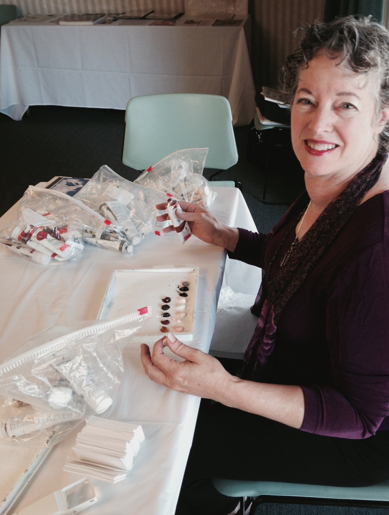
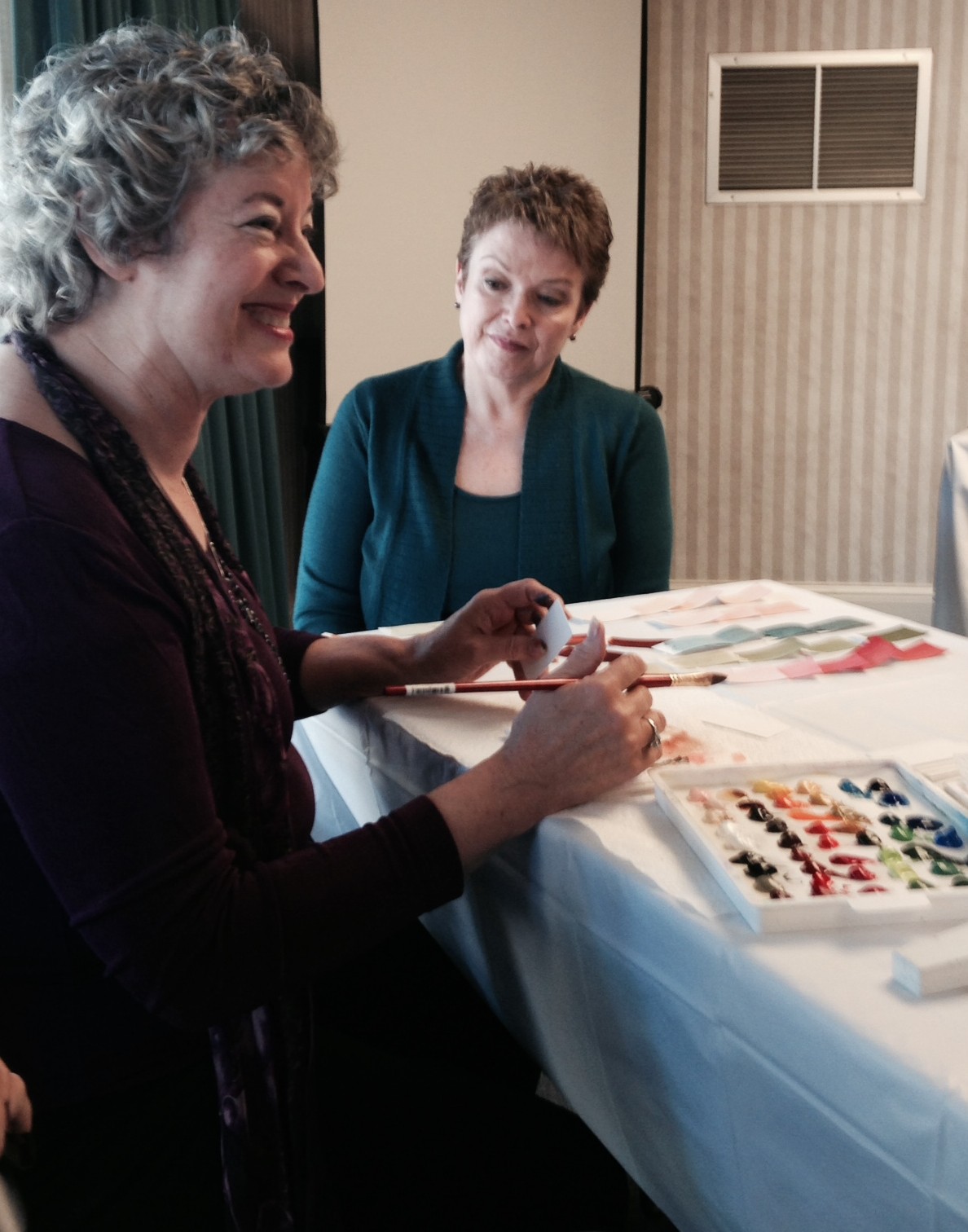
The first store that she opened sold craft based art, and later beads too. One day Joan took a gamble and bought six pairs of earrings by Laurel Burch to sell though they were pricier than her customers might want to pay. They “flew off shelves” so Joan decided it was wiser economically for her to sell earrings than beads. She soon became known as the “Earring Lady.”  One of Joan’s assistants in her shop gave her the confidence later (and thank goodness!) to also sell clothing.  When clients came in with palettes, holding them up to clothes, Joan was intrigued.  This was the start of her quest to understand seasonal color analysis through reading, attending workshops and having her own colors analysed many times.

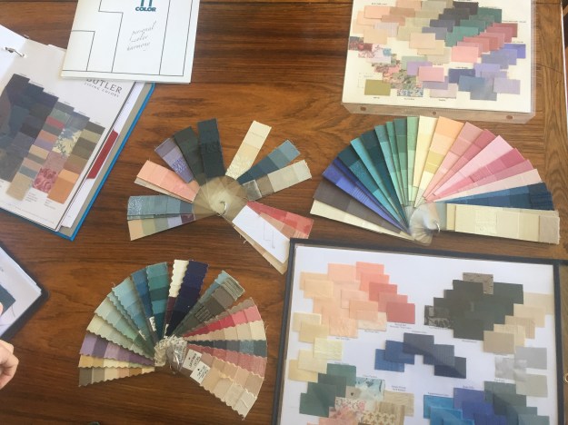
This is Joan’s Suzanne Caygill “Onyx Winter” palette on top.  It’s the first time I’ve seen a Suzanne Caygill palette presented in this plastic case format…

joanpalettesAnd, here’s the other side:joanpalettes3
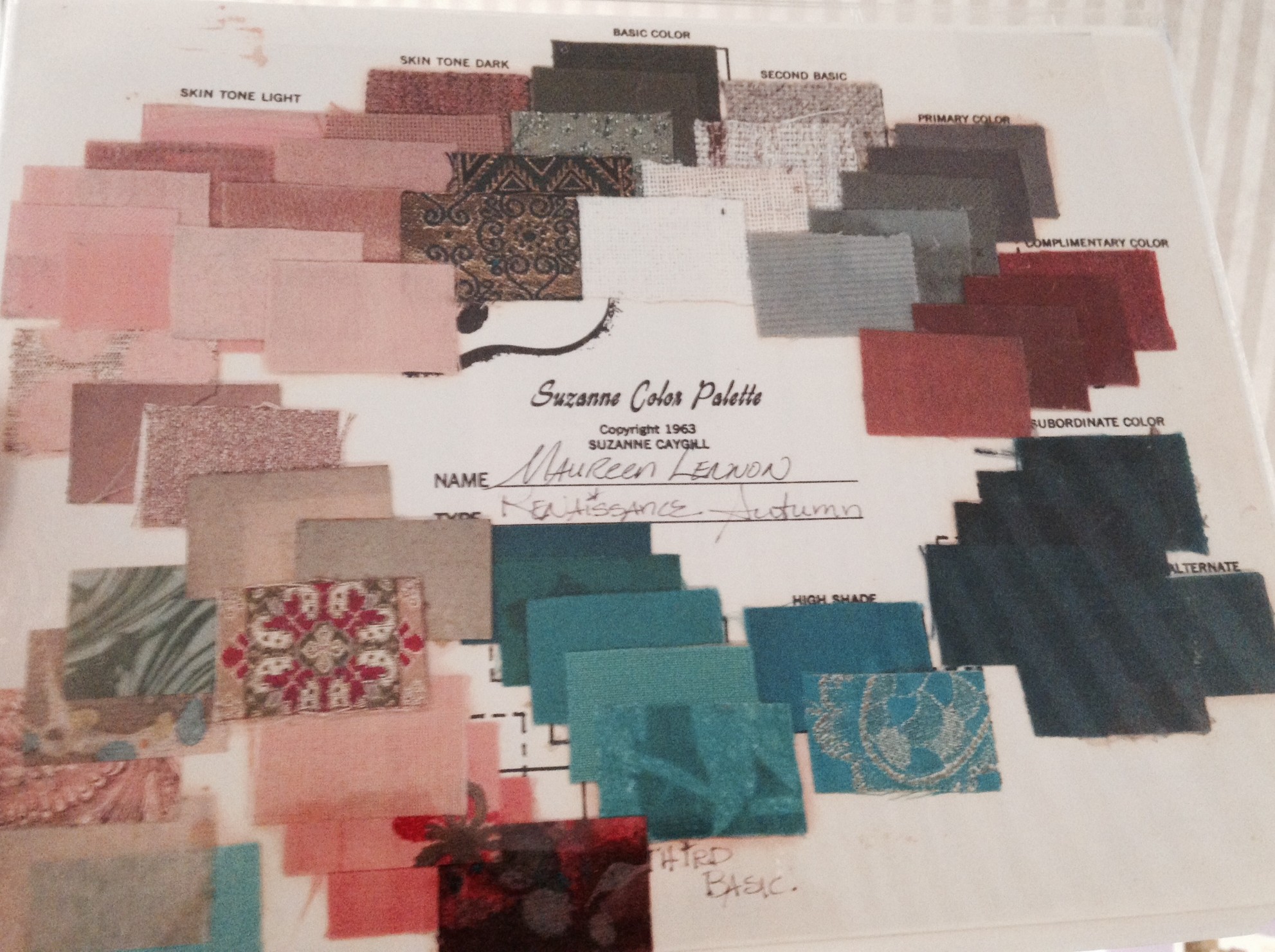
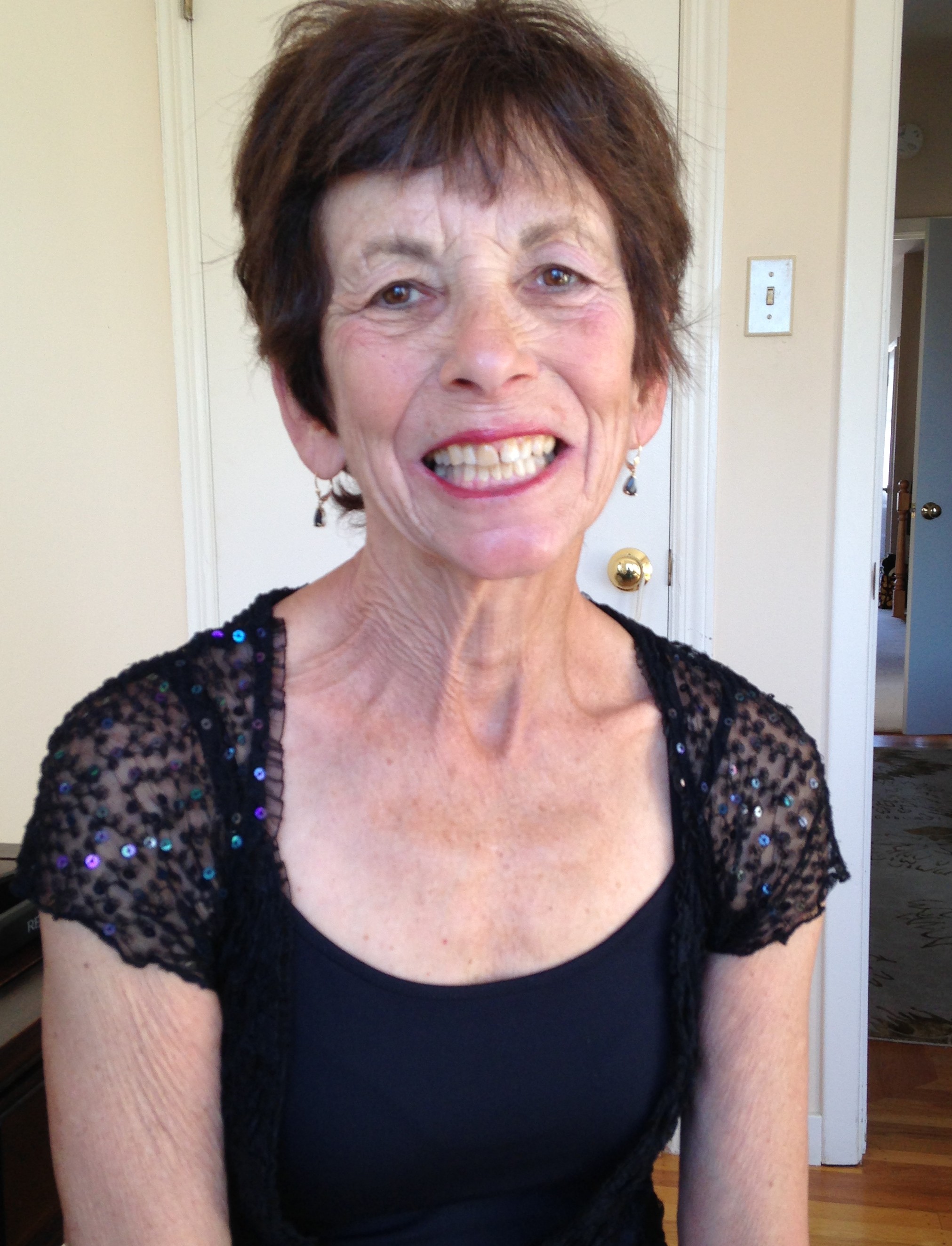
Below is a palette extension created for Joan later, by Dorothy Gietzen, one of Suzanne’s graduates.  It is this palette than Joan says she used the most.  Here she is with it.  Her hair was jet black when the palettes were made.

JoanCwpalettes Dorothy wrote, in beautiful handwriting, on the back of each card strip the categories that the colors fell into ( understated, dramatic, neutral, etc., and any additional notes such as how much of a color could be worn). JoanC1 If I could travel back in time I’d certainly want to shop in or better yet work at Joan’s store, Tarika.  Clients and sales assistants got free color and style advice and education.  Joan would record well dressed people on TV on tape to show her staff as a teaching aid!  She stocked garments in colors and styles that worked in seasonal harmony, making shopping in a way that would make Suzanne Caygill proud simply effortless.  Garments in summer colors were in summer styles, autumn colors in autumn styles and she and her staff understood the smaller variations too (that everyone wasn’t just one of four seasons but each had more differentiation).  Joan’s book has a concise chapter on “illusions” so no doubt her staff also knew about selecting the most flattering of garments within the s too. She had windows at the front and back of the store for good daylight and two changing rooms, one very romantic and feminine, one more masculine and ethnic.  Joan enjoyed watching clients choose which to use!

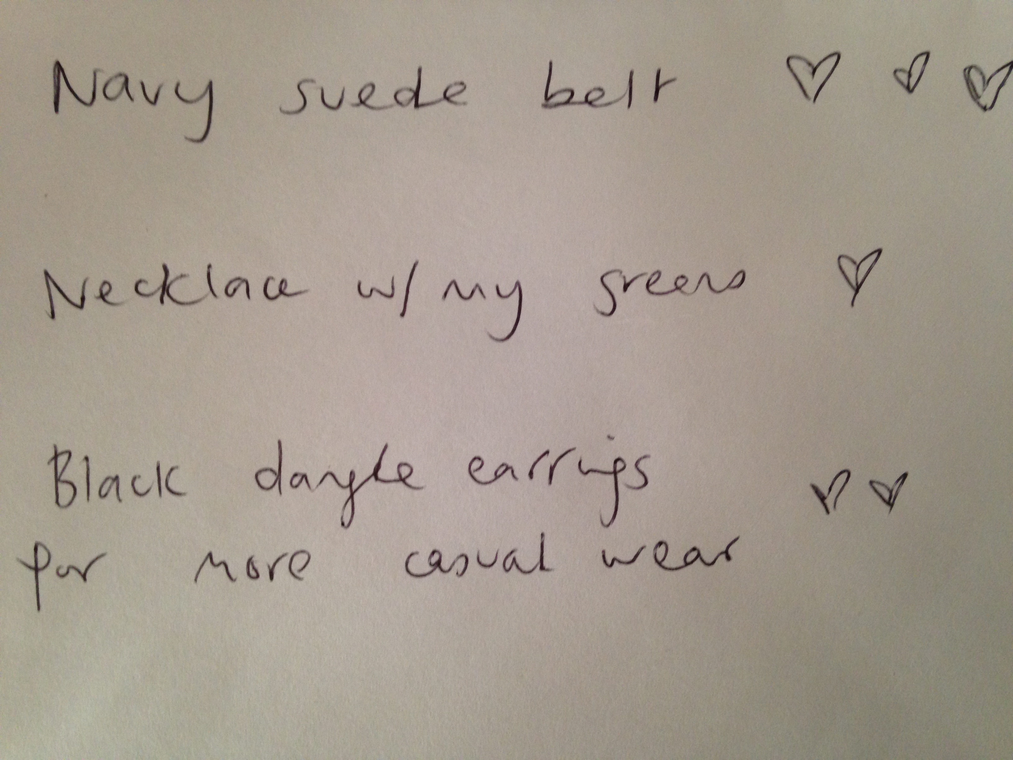
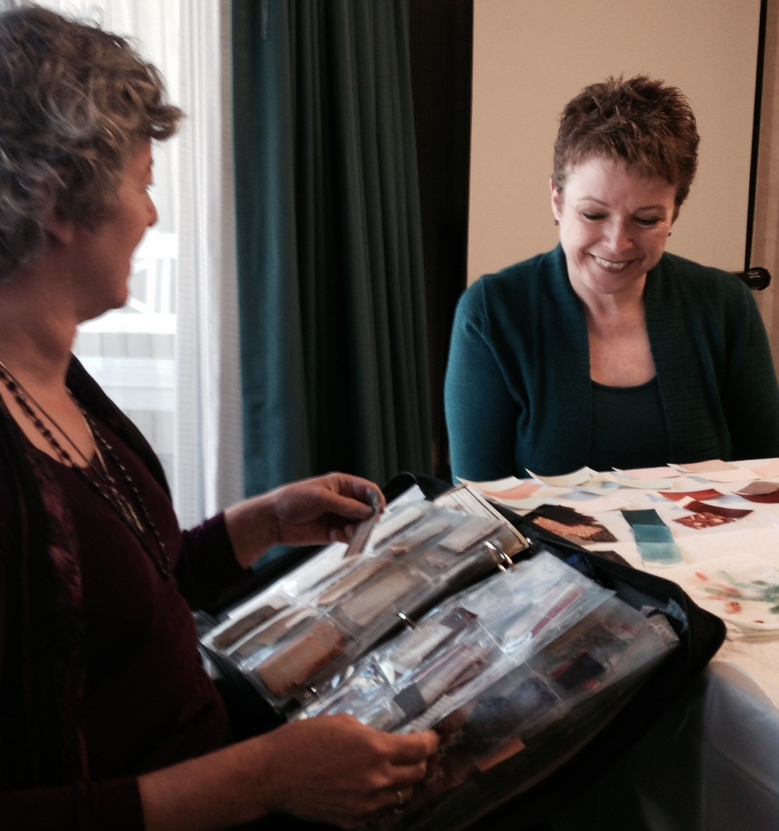
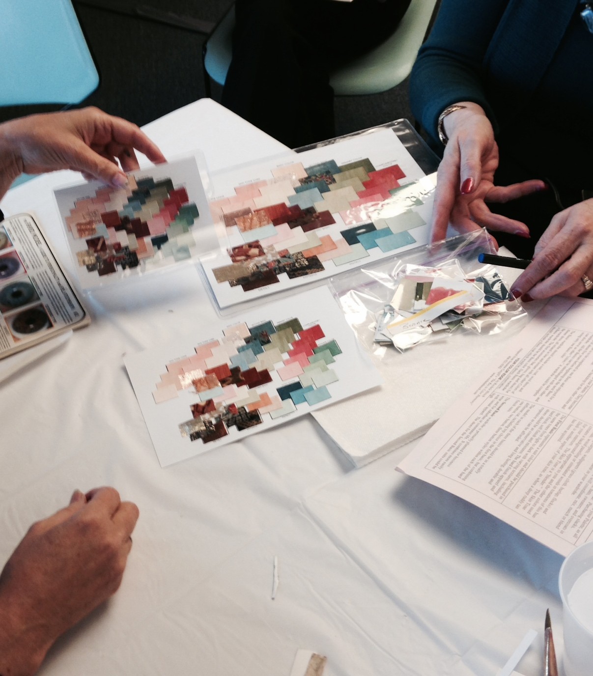
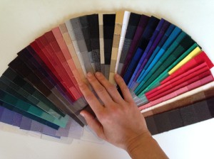
Joan mentions to me (and also wrote in her book) that she sees too many people online in style forums and, before, in her store, thinking they can only wear exact matches to the colors in their palette.  She would show people in her store how to open out their palette to see if the color or print in question blended with it.  She notes that fabric swatches are far easier to use than paint samples for this purpose.  Consider: I have approximately 3,000 fabric swatches to choose from for my clients.  The human eye, it is estimated, can discern 10 million colors.  An analyst can’t physically store and sort through that many swatches in a timely fashion even if we can discern the differences: it’s simply not practical.  (Though I admit I’d have fun having 10,000 swatches to work with or being able to magically alter my fabric samples ever so slightly!)  Clients therefore need to understand their palette and remember it’s the overall effect of an outfit that matters.  I’m so glad my teacher, Debra Lindquist, taught me this too and I’ve been passing “How to Use Your Palette” notes onto my clients when I send them their colors!

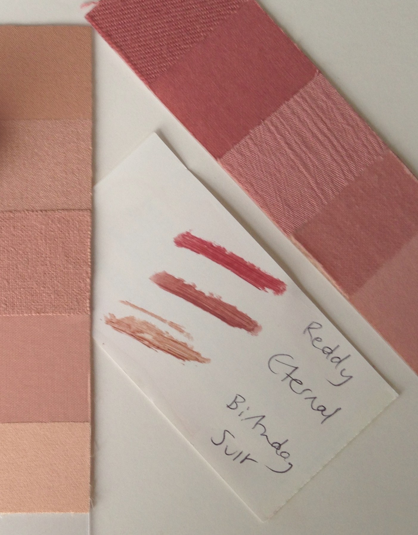
Joan suggests people add swatches to their palette when they find fabrics that fit between colors, whether from fabric bought for sewing a garment or a bit snipped from a seam if it’s a garment that was purchased.  It’s a nice way to add to your understanding certainly and, she notes that if it’s a print then having a snip in your palette in your purse will serve you well when shopping for coordinating items.

The most unexpected and genius tip I learned from The Color Connection has more to do with Slow Fashion and the wise purchasing of pieces generally.  Joan suggests that you keep a shopping wish list actually in your closet.  As items occur to you, you add them to the list and (and here comes the brilliant part), you also make a mark after the item each time you’re getting dressed and wish you had it.  When an item has lots of marks after it, it’s going to be a wise purchase and should go on your actual shopping list. 

wishlist

I asked Joan whether her book got the most favorable reception from consumers, designers or retailers (as her book has sections written for all three groups).  She laughed and said, “From color analysts!”  It wasn’t an answer I expected, but it makes complete sense. This sort of clearly written, all encompassing book was so needed!  I’m fortunate to now have a signed copy!

jcallawaysignedbook Joan not only wrote and owned her stores, but she also set up a Bereavement Outreach Group – the first of its kind-  and more recently set up a literacy program for at risk school children. I was curious which of her accomplishments she was most proud of. She had to pause to and chose co-founding All Things Right and Relevant a second hand store in Davis that provides work and job skills to those suffering from mental illness.  It’s part of a much larger support system for those with mental illness, providing everything from housing to counselling, so it was the big picture she was referring to.  After all, Joan doesn’t do things by halves.

Today, at her retirement community,  Joan leads a memoir writing group, and runs her own mini-library outside her front door.  joanlibraryAnd, due too demand, she’s working to get Color Connection republished!  It’s expected to be $48.  Whether you’re determined to find your best colors yourself (she has the BEST chapter on this), or you want to know more about style recommendations for the seasons, this is your book!  I’ll be sure to update you when it’s available. (SEE BELOW!)

If you want to read more about Joan, this is my favorite article about her.

Oh, and, last point. I also purchased Scientific Dressing by Marilyn Curtin, a book Joan recommends in hers. For anyone who loves to analyze the figure and wants to better understand style choices with regards to proportions, stance and head position (really!), this book has some interesting tidbits. I’m not jumping up and down saying, “Buy it!” as I didn’t love everything about it, but I’m glad I bought it as it made me think about a few new things.

UPDATE: The book is $52, a tiny bit more than anticipated but really it’s like three books in one.  GET IT, here.  And enjoy!
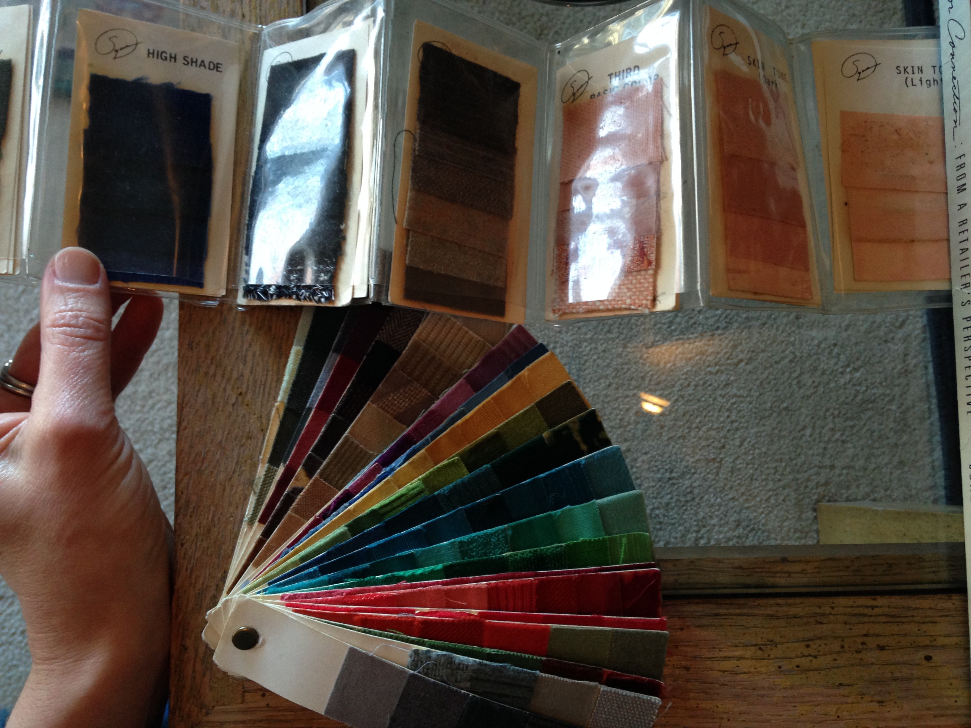
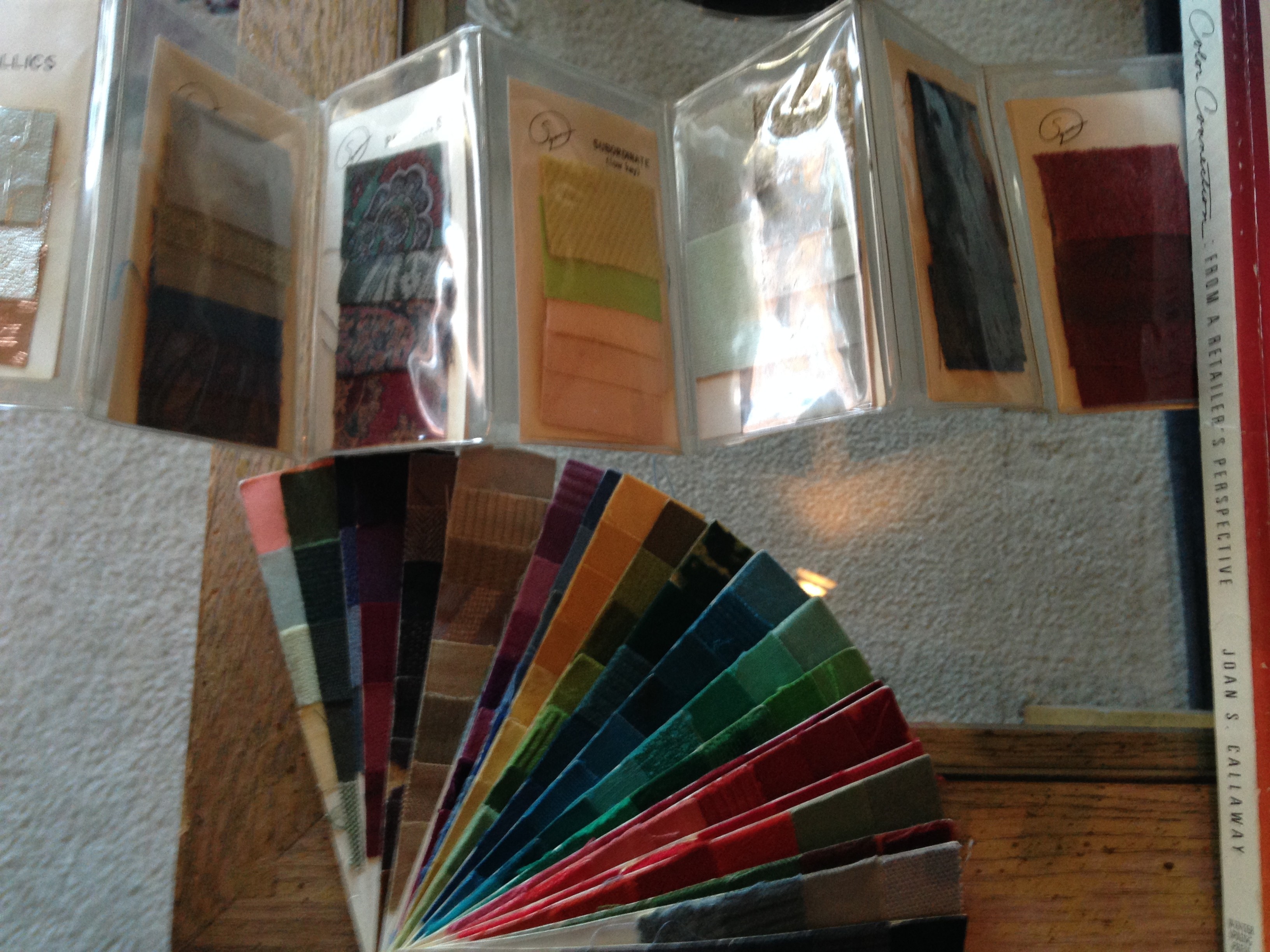
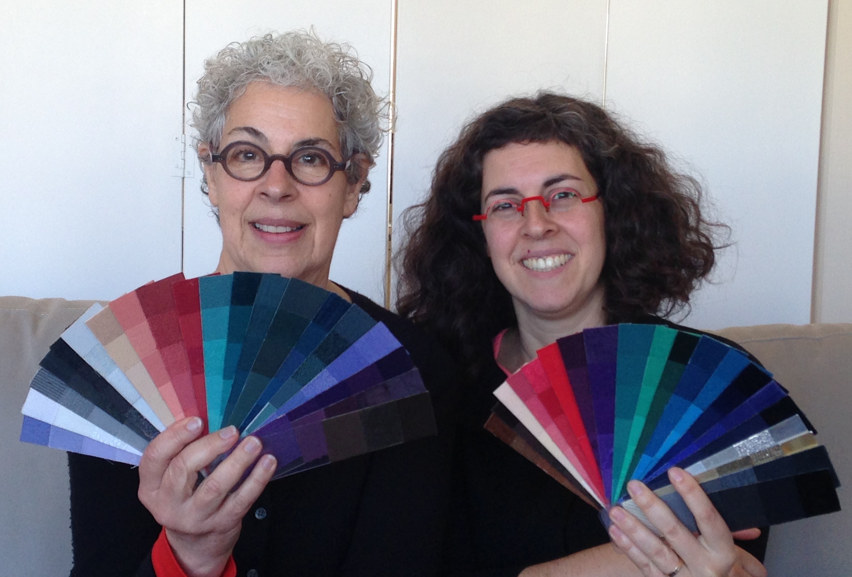
Turning 40, Slowly

As someone who’s always wanted to be in her thirties, I was grieving a bit in the weeks before my 40th.  Then a few days before my actual birthday an older friend gave me a card with a pack of post-it notes because, “It’s hard to remember anything these days!” Next, a large box arrived, sent from my best friend from middle school,  with a tiara inside and the note, “Welcome to the Big Kids Club!” The gestures were both so fun, it made it hard not to embrace the day. And not to laugh.

me40

After a family breakfast out on the actual day (tiara on head) followed by a fancy holiday party lunch, I went to the Fibershed Fashion Gala , at the Jacuzzi Family Vineyards in Sonoma.  Please, take 20 seconds to read this blog and see its photos as I can’t describe the concept behind Fibershed any better, any faster or with more beauty. More details are here.  Pretty cool, right?

I was curious to see locally made clothes and to meet the designers that made them. Would there be colors within my palette?  Styles that would suit me?  At prices I could afford?  You see in my dream world, I’d not only tell clients their best colors and styles, but which local (to them) designers to turn to for investing in new pieces.

Currently I buy most of my clothes nearly new, really thinking about how much value each piece will add to my life.  That’s how I do Slow Fashion.  But I wanted to know how else it could be done, both for me personally and for my local clients.

There were not as many garments and accessories to see as I’d envisioned, but there were plenty of surprise discoveries.  For instance, I was expecting only to see photos of furry beasts and then the woolen creations made from them.  But this woman uses only mushroom based dyes!

mushroom

mushroomdyes

lesliedress

I liked this designer’s trail-on-the-ground-urban-rather-than-bridesmaid-convertible dress.

ditto hangers

These hangers were part of a raffle prize, but apparently everyone (not just me) was asking about them, wanting to buy them.  Earth friendly and -for those of you with minuscule storage space or who want more of a boutique, airy and spacious feel in your wardrobe – they DOUBLE your closet space!  Ditto sells them in plain brown in three sizes – adult, children and infant, and their site has a sale through January.  Perfect as my daughter’s clothes have outgrown the hangers we have for her. The Container Store sells them fora bit more in black in the adult size only. Rave reviews here.

There was a bounty of gorgeous food that I was too full to actually relish. And look  how unexpectedly gorgeous wine barrels are serving as a backdrop for fashion!

fibershedfashiongala

And then, I stumbled across a woman selling the most wonderfully scented spray.  Ever since pregnancy, I’ve been exceptionally sensitive to scents, disliking most of them but this was incredible and I didn’t even know what it was. Room spray?  Body spray?  Something called “Cloud of Protection” it turned out, and typing this I’m laughing at the name, but if you smelled it first, as I had, you’d understand. Both nurturing and cleansing, with a brightening and uplifting result. I was hooked and intrigued: the maker seemed to understand scent in a way I’d never encountered.  I bought the sample kit for $20 and have since purchased the full size of The Balm (excellent for smoothing my hair into a ponytail) and “C” Perfect Skin , the oil, even though I’m not actually out of either yet. The oil is the best I’ve tried (I swear I look younger! Best birthday gift to 40 year old self ever, right?!?) and truly affordable. 

bynievesPlus the packaging is charming.  By Nieves is sold here.

yarn2

Dinner out completed the day.

In conclusion: the yarn for sale was beautiful but knitting isn’t my thing.  The prices of the garments I saw were too high for me personally, and the colors and styles weren’t my best. The kids clothing I looked at for my daughter was cute but not soft enough. (She’s very particular.)  So while I can’t say I’ve found new designers to go to or locally made yarn to create with, I can say I continue to be inspired by Fibershed and by Slow Fashion in general.  I enjoyed taking the time to go see what was being made.  I’ve found a smarter way to hang my family’s clothes.  I’ve got happier skin.  I spent time on my 40th birthday doing something I feel strongly about and something that makes me happy.  And, I realized that if what I want to buy to wear isn’t available locally YET, then I’m inspired to make it!  And while I think that’ll involve up-cycling old clothes, I’m letting my ideas on how to do that exactly percolate SLOWLY.  (Why rush, right?)  I want to savor the second half of my life more than I have the first.  After all, I just had the pleasure of turning 40.

Hand Painted Custom Palettes and More!

“Working” on my weekends has become so much more fun since I started doing custom color.  Saturday, I spent the morning learning about how custom palettes are hand painted and the afternoon finding out more about Suzanne Caygill.  I have lots to share!

Rochele HC Hirsch, who organized the Suzanne Caygill Legacy Event  I attended in August, also organized and led this day.  Rochele began her studies with Suzanne Caygill in 1987.  Two years later, Suzanne moved out to Atlanta, Georgia and Rochele served as her agent.  They were close until Suzanne died in 1994.  (Suzanne even decorated two of Rochele’s homes – really fun to hear about!)

Since her training, Rochele has ALWAYS hand painted palettes for her clients.  And, to date, she has created over 1100.  Yup, over 1100.  

Rochele  uses acrylic paints and Strathmore drawing paper.

rochele setting up

She begins by painting light, medium and dark skin tones, looking at the clients’ arm and hand, and comparing what she has painted to the client’s face.

rochele painting

(Skin tone swatches are not always painted to be exact matches – sometimes she lifts the color.)

As she works, Rochele makes tiny tapping motions with her brush above the deposits of paint on her own palette, and quietly murmurs questions and also answers as she feels and intuits her way to the colors that best work to create the client’s palette.  

She tells us which pigments she is using and when she needs to make adjustments. 

Next, Rochele paints the reds (shown below).  She goes on to look closely at her client’s eyes.

rochele reds

rochele eye chart

She tells her client what she learns about them looking at their eyes’ structures using  Denny’ Johnson’s Rayid Model.  (She passes around a guide to the Rayid Model, shown in the photo at right.)

rochele eye colorsAbove you can see the swatches painted based on eye colors.

Rochele’s early discovery that the client needs Burnt Sienna added to colors to make them work for her continues to hold true.  Rochele says that Autumns tend to need Burnt Sienna in their best colors.

rochelepaintingmore

No one is suprised that the teal of the client’s sweater is included in the palette.

Rochele then pulls out a very large binder of neatly organized fabric swatches. They are allrochelechoosingprintsprints.  ( I tease her, saying, “You don’t paint the prints too? ”  She says that painting more than plain color swatches that doesn’t interest her.  Fair enough!  I’m plenty impressed!)

rochele first cut

As folks head out to lunch, out comes a mini-paper cutter.  Rochele cuts and glues the paper she has painted to create three separate palettes.

The client receives a larger and a smaller (purse friendly) palette; the third palette is for Rochele’s own records, with information about the client noted on the back.

There are also “extra” pieces – the ends of the painted swatches and these go in a plastic bag for the client to take home.  These extra bits of color swatches can be manipulated – moved around – to try out different color combinations made possible in the palette.

three plettes rochele

rochelefinalpalettewithbernie

Here is the client with her “Metallic Autumn” palette.

The swatches are laid out in the traditional Caygill manner, shown also in this palette which was created by Suzanne, herself:

rochelescaygillexample

It is for a “Renaissance Autumn,” a sub-type not included in Suzanne’s book, Color, The Essence of You.  (Please note the diagonal lines seen in the darker blues on the right are reflections of the wallpaper – those are not prints.)

In the afternoon, we watched the video that Suzanne Caygill’s clients saw while waiting to have their colors done.  In it, Suzanne, seated at a table decorated with flowers and lit candles,  is talking, describing her understanding of colors and their connection to the seasons.  She holds up photo collages of of people with images from nature to illustrate what she is saying.

We heard a funny story of a man in Suzanne’s waiting room horrified to discover that all the eyes had been cut out of the magazines! (Oh, Pinterest and Polyvore, where were you when Suzanne needed you?)

And we see lots of photos from Rochele’s time with Suzanne.  My favorite photo was of Suzanne, Rochele and two other women  wearing dresses that Suzanne had designed for an event, and named “Nothing Dresses.”  They were in metals not skin tones, for those wondering!

Color analysis is only part of Rochele’s field of expertise.   She studies relationship dynamics and their connection to inherited beliefs, and she’s written a book about it.

Rochele travels the world making hand painted palettes (and sharing intuition with her clients about what is going on within them and within their relationships).   Her travel schedule can be found here.  Palettes by Rochele are $350 and include the larger and smaller size and also the bag of extras.  It is sure to be a memorable experience and I can’t wait to see which readers consult with her first!  (Anyone in Singapore?  She is headed there soon.) Recommended for those of you curious to see hand painted intuited colors!

If you’d like to have her come to your town, contact her.  Typically you need five to six clients and if you provide her with accommodation and assistance (assembling the palettes), you get a great deal on your own palette!

Decoding Color Exquisitely

The only kind of high that I like is a color high.  I’m coming down off one now and it’s a dreamy, soft descent.  It started with a gentle glow at a book reading on Sunday afternoon, amid an eager crowd, hearing women whispering of paint and clothing colors as I found a seat.  Then mother and daughter authors, Joann and Arielle Eckstut, took to the podium and filled the room with laughter, delight and many a gasp, as they shared favorite snippets from their their visually stunning book, The Secret Language of Color (officially on sale October 22nd but available for preorder here ).

With slides to accompany their talk, they confounded the audience with optical illusions; bookreadingwowed us with nature’s beauty and challenged our brains with the physics of color.  (For the record, that tree that fell in the forest without a sound?  It was colorless too.)  Our magical journey through the rainbow involved leaps through history, trips over seas and reflections on the sky; we put on robes of the aristocracy and the eyes of bees.

And, then just as I was getting the hang of flying through time and space, and inhabiting other species minds’, the color ride and indeed Q&A time was over and the pot of gold – the book itself – was at the cash register.  Legs moved fast and for a short while the vibe turned tense as there appeared to be a shortage of copies of books for sale. “That one is mine! But, yes, you can look!” I heard several times.

Outside, sitting in the sun (Book Passage in Corte Madera has the nicest set up), I dived into the book, then splashed around like a dolphin, frolicking in the sea.  I delved deeper at home.  The book  tantalizes, but more importantly, it satisfies.  It’s the kind of book you can enjoy for a minute here and there just as much as an hour now and then. The photos are glorious and seemingly never-ending, the graphics flawless and the writing is charming. And, for those of you who often feel cheated of intellectual depth in coffee table books, you can rejoice!  There is real substance here.  Spare yourself three years of color related research and read this.  (With the saved time, you might like to try out the recipe for tyrian purple (purple made the old fashioned way).  Warning: you need 1000 mollusks and good aim.)

Obsessed with color as it relates to the human body, my own favorite morsels include:

  • learning that humans are better able to discern shades of yellow than any other hue.
  • seeing Pierre David’s Human Pantone rainbow collage, comprised of (photos of) human skin.  (It is beautiful not macabre!) Enjoy that artistry here.
  • discovering that plants have small amounts of melanin too, evident in fruits that bruise!

Speaking of which, I knew that our color vision was thought to have developed to allow us to find the ripest fruits. But there is a new theory, did YOU know?  

  • Our vision may have evolved to being more complex  (though not as complex as a butterfly’s) to better understand other people around us! That leg is a bit blue, that face is turning green, that person’s chest and now neck and now face is going RED!  Respond!!!

No one, the Eckstuts will tell you, is an expert in color, yet you certainly feel a lot smarter with words from these women at your fingertips.  In addition to being authors, Joann Eckstut, founder of The Roomworks, is an interior designer and color consultant; her daughter, Arielle Eckstut is a professional Book Doctor and co-founder of LittleMissMatched.  Both predict annual color trends for the Color Association of the United States, Joann for interiors/environment and and Arielle for young fashion.

My hour at the reading was fabulous enough but then I had the additional pleasure (hence the sustained color high) to chat with these woman again the next day as I showed them how I find personal colors.  It was quite a treat.

. joann and arielle

Almost done…joannfinalfan


photo

Joann’s also has shiny silvers, some plums and more warm reds.

Arielle’s also has nearly stark whites, lucky-in-the-East yellows and a few more orange-reds. 
photo

The black and silver in the middle are shared.  

Now, go and get this book.  You can’t, in all seriousness, call yourself a Colorista, a Color Freak or a Color Nerd without it.  It’s also a great  gift for any of your friends who fancy themselves part scientist/social scientist/artist or trivial pursuit master.  Even a color blind, mathematician friend would probably love it.  It’s that good.  Really.  (Buy it hereor, support your local bookseller.)

The beautiful fabric swatches I use are part of Debra Lindquist‘s Color Profiles System.

A Makeover for my Mom for her 70th!

My mom’s entire wardrobe would fill a single suitcase and the makeup that most women travel with to work is more than my mom actually owns.  So when my dad asked if he could treat her to my smaller size custom color palette (my FLIRT palette) so she that she could use the colors as a guide to buy some new lipstick for her 70th birthday party dinner, I thought, “Nooooooooo!” *insert giddy laughter* ,”We have to do the WHOLE palette!”  (You can read about my different custom color packages here.)

mombeforeusethisone

WHEN WE STARTED….

While my dad’s goal for my mom might have been new lipstick, my goal was a makeover.  Here’s why: my mom’s hair was dyed and the color needed work (see right).  I figured that if I had enough time to show her how the warmth of her hair was confusing her overall look and therefore her color palette, she’d get her hair color corrected.  Happily, my plan worked.

When hair is not harmoniously dyed, creating a temporary palette for a person is an option and that’s what I started to do for my mom but fixing the color is better as then you’re not compensating for color that is off.  (To see why hair color affects a custom palette, see this largely pictorial blog post which involves Elmo and imaginary friends.)

My mom is holding the part of her custom palette that was certain  – the part of her palette that is known as her “body colors.”  From left to right she’s holding her skin tone swatches; her natural blush tones;  her eye colors swatches, and then her hair color-to-be swatches that I’d chosen (to take to the salon).  As she  went off to call a new hair dresser, I decided to purchase some lipstick.

My mom won’t wear lipstick if it isn’t EXTREMELY moisturizing so I wanted to get her Silk Naturals brand.  (See their selection here.)  With just her skin and blush tone swatches in front of me, I opened my laptop.   Note: Silk Naturals has excellent swatch photos on their site or there’s absolutely no way I’d have done this.  (And, not that I’ve ever used it, but they also have an excellent return policy.)  

I wanted to get my mom a nude, a pink and a red  lipstick –  for my mother who has never owned three lipsticks at once!   It was imperative that I found colors that connected with both her skin tones AND her blush tones.  You can see  below that my choices (Birthday Suit, Eternal and Reddy)  mesh beautifully in this regard.  Actually put on my mom,  these lipsticks look more pink/red. roz makeup The lipsticks arrived just in time and – success!  – each of them was fabulous.  My mom’s hair was dyed…and then we went back to creating her palette. Here, with her custom palette just completed, she is wearing her pink lipstick, Eternal, and holding the same “body colors” from earlier.  Isn’t she looking gorgeous? momfinal Ok, aside from the nail polish she had on not jiving.

I bought her a couple of new tops on ebay and here she is wearing one of them with Silk Natural’s lipstick Birthday Suit, the nude lippie that she’s taken to wearing most of the time. birthdaysuitlippie And here she is wearing Reddy and the other top I got her (with sequins that reflect the colors in her palette): reddy In general, using your custom color palette to buy makeup is as simple as matching your fabric swatches directly to makeup and/or finding makeup in colors that fall between your skin tones and your swatches. For example, here are three of my blushes next to my palette.  You can see that Desert Plum (in the middle) and Pretty Plum (far right) are exact matches and that the blush on the far left, Lady, falls between the pink to its left and my lightest skin tone swatch to its right. myblushesandfan Another example: my most used Silk Naturals lipsticks, Fashionista, Rapturous and Sultry, are swatched below on paper next to my blush colors and skin tones. You can see how they visually make sense with these strips of swatches. Then, my favorite eyeshadows, Mohave and Prowl,  lie happily between my skin tones and my dark brown swatches (which are actually my hair color swatches). kathymakeuforblog 
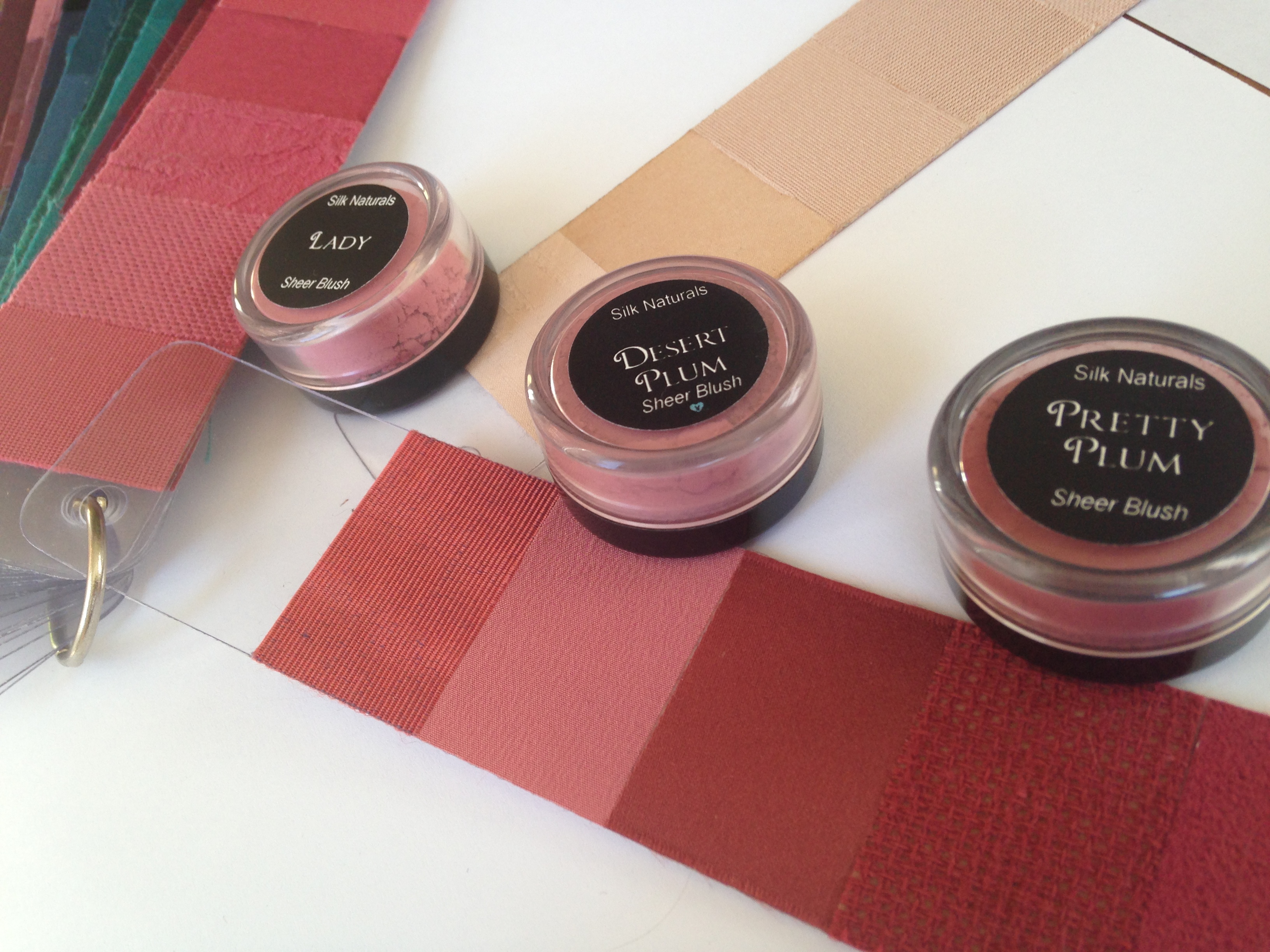
Sooooooo, if YOU need a makeover, where better to start than with a Custom Color Palette from Beauty Valued?  (It can be done in person or online from LOTS of photographs.)  And if you buy from Silk Naturals, be sure to look at the photos of the swatched make up, not just their color indicator “dots”.

Notes come with a palette and include further details on makeup selection and how to assess current and potential clothing.  Plus, there is also customized info regarding personal style.  (For a fun example of accompanying notes -minus makeup info, as it’s for Elmo – read this post.)  

And if you want to know tips for buying clothes on ebay, keep reading. My previous blog post is about just that!